Invoice design: principles, layouts and examples

Nnabuike Okoroafor ·
On this page · 13 sections
Your client opens the invoice, looks for two things, how much and by when, and either finds them in a second or starts hunting. Good invoice design is mostly about that second. It decides whether the invoice gets paid on the first read, gets forwarded to accounts without questions, and looks like it came from the same business as your website and your work.
This guide covers the design of an invoice from the ground up: the layout and reading order, visual hierarchy, typography, colour and contrast, white space, and the difference between designing for a screen and for paper. Then it shows six layout styles with real examples, compares the tools people use to design invoices (Word, Excel, Canva, InDesign and invoicing apps), and ends with a checklist of the mistakes we see most.
If you already have an invoice and want to change it safely, how to customize an invoice without breaking it is the practical companion to this post. This one is about the principles underneath.
In short#
- Invoice design has one job before any other: the amount due and the due date must be the first things a reader finds.
- Follow the reading order clients already expect: who it is from, what it is, how much and by when, who it is for, the line items, the total, how to pay, then notes.
- Use a clear type hierarchy: about four sizes and two weights, one or two font families, and figures that line up.
- One brand colour, used in three places at most, with text that passes a 4.5:1 contrast check.
- Design for both screen and paper: a PDF that reads on a phone and prints cleanly in black and white on A4 or Letter.
- Pick a layout style that suits the work, then stop redesigning. Consistency is part of the design.
What good invoice design does#
An invoice is read differently from almost anything else you send. Nobody reads it top to bottom for pleasure. Your client scans it for the number and the date, the person in accounts scans it for the invoice number, your details and the payment instructions, and later someone checks it against a bank statement. Good invoice design serves all three readers in that order.
That gives three tests for any invoice design:
- It gets read. The amount due, due date and invoice number can be found in a glance, on a phone, without zooming.
- It gets paid. Payment details sit where the reader finishes, with a reference to quote. Nothing about paying requires a follow-up question.
- It looks like your business. Your logo, colour and type match the rest of what the client has seen from you, so the invoice feels expected rather than generic.
The third test is the one most often left until last. The answer is not decoration. It is structure first, then a small amount of brand on top. Why your invoice should look like your business makes the case for the brand side; the rest of this post is the structure.
The layout: what goes where on an invoice#
Invoice layout design is less free than it looks, and that is a good thing. Clients and their accounts teams have read thousands of invoices, and their eyes go to the same places each time. Put the information where they look and the invoice reads faster than one that is cleverer.
Here is the reading order, drawn on a sample invoice:
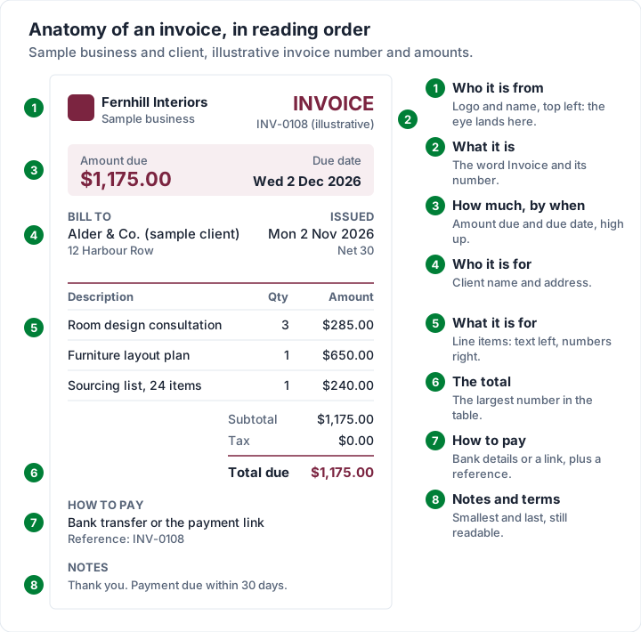
The same order as a table, with where each block usually sits:
| Order | Block | Usual position | Design note |
|---|---|---|---|
| 1 | Who it is from | Top left | Logo and business name; contact details in small type |
| 2 | What it is | Top right | The word “Invoice”, the number, then the dates |
| 3 | How much, by when | Top, in a summary box or line | Optional but powerful: repeat the amount due and due date here |
| 4 | Who it is for | Below or beside your details | “Bill to” label, client name, address, any reference |
| 5 | What it is for | Middle, full width | Line items: description left, numbers right |
| 6 | The total | Bottom right of the table | The strongest number on the page |
| 7 | How to pay | Bottom left, or beside the total | Bank details or a link, plus the reference to quote |
| 8 | Notes and terms | Last | Short, smaller, still readable |
Two layout choices make the biggest difference:
- A summary near the top. Many invoices put the only total at the bottom of the table. A small “Amount due / Due date” box under the header answers the reader's first question before they scroll. The bottom total stays; this repeats it.
- Payment details where the reader finishes. The eye ends at the bottom of the table, so that is where “how to pay” belongs. Hiding it in the footer in 7-point grey sends people back to email to ask.
For the fields themselves, and which ones your country requires, see what actually belongs on an invoice. Design arranges the content; it does not decide it.
Visual hierarchy: make the total and due date win#
Hierarchy is the order in which things get noticed. You control it with size, weight, colour and space. A flat invoice, where everything is the same size and weight, forces the reader to read every line to find the one that matters.
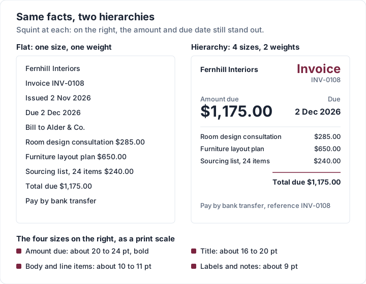
A practical way to build it:
- Decide the order of importance. For almost every invoice: amount due, due date, invoice number, who it is from, then everything else.
- Give each level one treatment. Four sizes is plenty. The scale in the diagram is a sensible starting point for a printed page, not a rule from any standard.
- Use weight before colour. Bold is the cheapest way to say “look here”. Colour is a second signal, and it fails on a black-and-white printout.
- Shrink the labels. “Invoice date”, “Bill to” and column headers can be smaller and muted. The values next to them are what people read.
- Run the squint test. Step back or blur your eyes. Whatever still stands out is your hierarchy. If it is your logo or a decorative band rather than the amount, adjust.
The total deserves one more note. It should be the largest number in the table, set apart by a rule or a light tint, and labelled plainly: “Total due” or “Amount due”. If there is a deposit or a part payment, show it as a line and make the balance the strong number, not the original total.
Typography for invoices#
Invoices are mostly numbers, names and short phrases. That shapes the type choices more than taste does.
Two families at most. One for headings, one for everything else, or a single family in two weights. A heading face with character is where personality belongs; the body face carries addresses, descriptions and amounts, and should be plain.
Figures that line up. Many typefaces offer tabular figures, where every digit has the same width. In a column of amounts, tabular figures keep the decimal points aligned, so $1,175.00 and $240.00 can be compared at a glance. Proportional “old-style” figures look elegant in a paragraph and wobble in a column.
Readable sizes. On a printed A4 or Letter page, body text of about 10 to 11 point reads comfortably, and we would not set anything a client needs to act on below 9 point. A PDF opened on a phone shrinks the whole page, so small type on paper becomes tiny type on a screen.
Clear digits. Check that 1, 7 and the letter l look different, and that 0 and O do too. Script and display faces often fail this, which is fine for a heading and a problem on an amount.
| Choice | Works well | Avoid |
|---|---|---|
| Heading font | A serif or a distinctive sans in your brand | More than one decorative face |
| Body font | A plain sans or serif with tabular figures | Condensed or light weights at small sizes |
| Numbers | Tabular figures, right-aligned | Script faces, centred amounts |
| Case | Sentence case labels, or small uppercase labels with spacing | Long lines in all capitals |
| Emphasis | Bold for the total and due date | Underline, italics and colour all at once |
Colour and contrast on an invoice#
Colour is the quickest way to make an invoice look like yours, and the easiest way to make it hard to read.
One brand colour, three jobs at most. The title or header, the rules between sections, and the total (or the amount-due box) is usually enough. Body text stays dark on a light page. A second colour is rarely needed; if you use one, keep it quiet.
Check the contrast of every text colour. The W3C's web accessibility guideline, WCAG 2.2 success criterion 1.4.3, says “The visual presentation of text and images of text has a contrast ratio of at least 4.5:1”, with a lower 3:1 for large-scale text, defined as “at least 18 point or 14 point bold”. It was written for web content, but invoices are often read on a screen, so it is a sound benchmark. The same page notes that “Text that is part of a logo or brand name has no contrast requirement”, but that brand guidelines do not exempt other text. Your logo can be pale; your header text cannot.
The most common contrast problem is not text on white. It is text on a coloured header band:
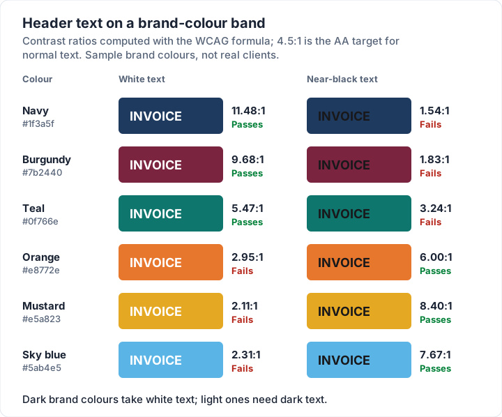
The pattern is simple: dark colours take white text, light and bright colours need dark text. Teal is the interesting row. White passes at 5.47:1, but it is close enough to the line that a slightly lighter teal would fail. If your brand colour is a bright orange or yellow, use dark text on the band, or use the colour for a rule and a tint instead of a solid band.
Two more colour rules:
- Do not rely on colour alone. A red number with no word next to it means nothing on a greyscale printout, or to a reader who cannot tell red from green. Write “Overdue” or “Credit”.
- Use tints, not solids, behind text. A pale tint of your brand colour (10 to 15% on white) behind the amount-due box keeps the text dark and the contrast high.
Logo on an invoice covers how the logo and the brand colour work together, including logos on coloured backgrounds.
White space, alignment and the grid#
White space is what makes an invoice look calm and considered rather than cramped. It is also what lets the hierarchy work: a total with space around it stands out without needing to be bigger.
- Generous margins. Leave roughly 15 to 20 mm (about 0.6 to 0.8 inches) around the page. Printers clip the edges, and a margin gives the content a frame.
- Group, then separate. Keep each block's lines close together and put more space between blocks. Your address is one group, the client's another, the dates a third. Space does the job that boxes and borders usually do, with less clutter.
- Align to a few edges. Pick a left edge for text and a right edge for numbers, and line everything up to them. An invoice with five slightly different left edges looks messy even when nothing else is wrong.
- Text left, numbers right. Descriptions read from the left. Amounts compare from the right, where the decimal points line up.
- Fewer lines, not more. A grid of borders around every cell looks like a form. Thin horizontal rules between rows, or alternating light shading, are easier on the eye.
A simple test: cover the invoice with your hand, uncover it for one second, and ask someone what they saw. If they say the total and the date, the spacing is doing its job.
Designing an invoice for print and for screen#
Many invoices are sent as a PDF and read on a screen, often a phone. Some are printed, filed or handed over in person. A good design works for both, and a few choices pull in different directions.
| Concern | On screen (PDF, email, phone) | On paper |
|---|---|---|
| Page size | Still matters: the PDF keeps its size | A4 (210 × 297 mm) in most countries; Letter (8.5 × 11 in) in the US and Canada |
| Colour | Solid colour bands look sharp | Large solid areas use a lot of ink and may print streaky |
| Contrast | Pale text vanishes on bright screens | Pale text vanishes on greyscale copiers |
| Type size | A full page shrinks on a phone: avoid tiny text | 9 point is about the floor for anything important |
| Links | A payment link can be tapped | Print the link short, or as bank details; nobody types a long URL |
| Logo | A small, sharp file keeps the PDF light | Needs enough resolution not to look soft |
| Layout | One page, no horizontal scrolling | One page if you can; repeat the header on page two if not |
Three habits catch most print and screen problems:
- Open the PDF on your phone before you send it. If you have to zoom to read the amount due, the hierarchy or the size is wrong.
- Print one copy in black and white. If the total disappears into a coloured band, or a background pattern runs behind the line items, fix it.
- Use your client's paper size. An A4 invoice printed on Letter loses its bottom edge, and a Letter invoice on A4 gets an odd gap. If you bill clients in both, check both.
Sending an invoice by email covers the message that goes with the PDF.
Invoice design examples: six layout styles#
Under the colours and fonts, most invoice designs use one of a handful of skeletons. Knowing them makes it easier to choose one, and to explain to a designer what you want. These six are the layouts most of the 60 templates in Charming Invoices are built on (two newer ones add a ruled page frame and a coloured edge strip); they are just as useful as a vocabulary if you design your own.
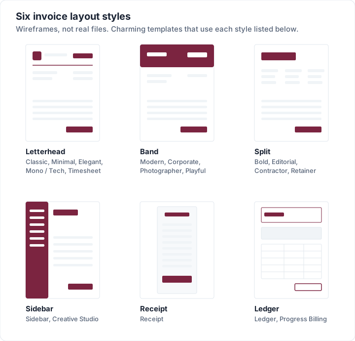
| Layout style | What defines it | Suits | Watch out for |
|---|---|---|---|
| Letterhead | Logo and title at the top, a rule, then content on white | Almost anyone; reads as established | Can look plain without a good heading font |
| Band | A solid colour band across the top | Brands with a strong colour; photographers, studios | Header text contrast; ink on printouts |
| Split | A large title with details in columns | Creative and project work, contractors | Needs space; long addresses wrap |
| Sidebar | A coloured column holding your details | Studios and freelancers who want a distinctive look | Narrower table; long line descriptions wrap |
| Receipt | A narrow, centred column | Quick retail sales, short invoices | Not ideal for many line items |
| Ledger | Boxed header, summary box, boxed table | Formal clients, progress billing, accounts teams | Can feel like a form; keep it light |
Two real examples, both filled with the same sample invoice. The first is the Editorial template, a split layout with a large serif title and the details in three columns:
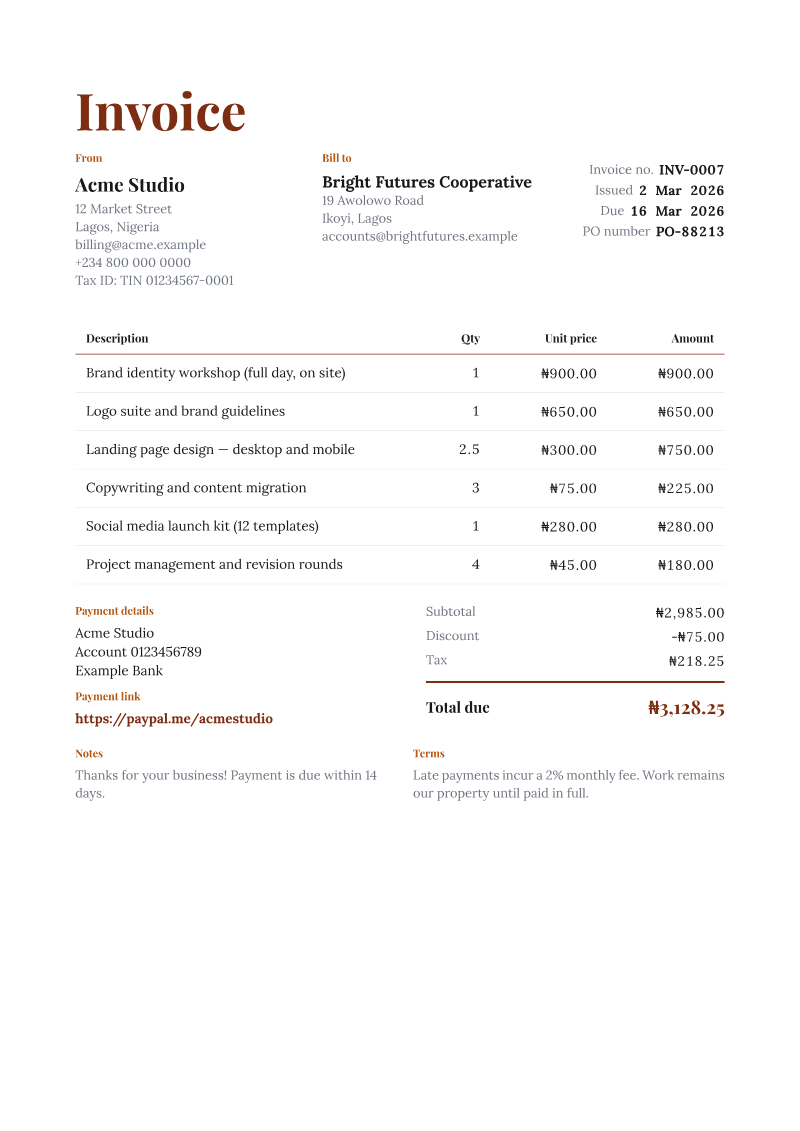
The second is the Sidebar template, which moves the business, client and invoice details into a dark column and leaves the table on white:
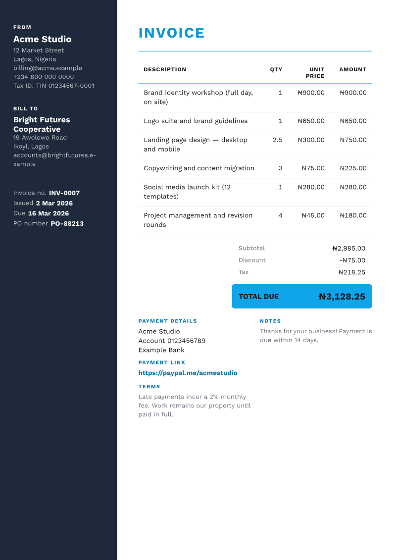
Look at the total box in the Sidebar example. The fill is a bright sky blue, so the total is set in dark text, not white. That is the band chart above applied to a real file.
For filled examples of different kinds of invoice (hourly, deposit, retainer, progress), see invoice examples: 9 sample invoices, annotated.
Designing an invoice in Word, Excel, Canva or InDesign#
You do not need special software to design an invoice. The right tool depends on whether you value control over the look or arithmetic you can trust.
| Tool | Design control | Calculates totals | Best for | What to check |
|---|---|---|---|---|
| Word or Google Docs | Good: fonts, colours, a logo, tables | Not on its own; you type or add field formulas | A few invoices a month, mostly flat fees | Check totals by hand; numbering is manual |
| Excel or Google Sheets | Moderate: cells, borders, a logo | Yes, with formulas | Hourly or itemised work | Layout takes more setup; check formulas when you add rows |
| Canva | High | Treat the numbers as typed text | One-off invoices where the look matters most | Check every total yourself; keep numbering and records separately |
| InDesign | Highest: grids, styles, master pages | Treat the numbers as typed text | Designers who want a fully custom layout | Keep totals, numbering and records separately |
| Invoicing app | Depends on the app's templates | Yes | Regular invoicing, reminders, records | Layouts come from the app's templates |
The pattern behind that table: layout tools give you freedom and leave the arithmetic to you, and spreadsheets and apps do the arithmetic within a set layout. If your brand uses patterns, gradients or watermarks, remember that a busy background behind the line items is exactly what the print test catches, so if you go that way, keep the pattern to the margins or the first page, and keep the table on plain white.
If you want a plain starting point to design on top of, our free invoice templates for Excel and Word are blank Excel and Word files. The Excel invoice files calculate (each line is quantity × rate rounded to the cent, then subtotal, a fixed discount, one tax rate and the total, which never drops below 0); the Word invoice files do not calculate, so you type the totals yourself. They are made for Excel and Word; Google Sheets and Docs can open them after conversion, which we have not checked, so check the totals after converting. The guides to the Excel invoice template and the Word invoice template explain each file and how to change its look. To see the same files filled in for one trade, our photography invoice template has three worked samples.
If you design invoices for clients as part of your own work (a designer building a client's billing documents, for instance), price that as design work. Designers, stop undercharging is about exactly that. For invoicing your own design projects, the graphic design invoice template has revision rounds, a deposit and a kill fee filled in.
Invoice design mistakes: a checklist#
Run any invoice design through this list before you use it.
| Check | Pass when |
|---|---|
| Amount due | It is the most prominent number on the page |
| Due date | It is a real date, near the top, not only “Net 30” in the footer |
| Invoice number | It is easy to find and copy |
| Hierarchy | About four sizes, two weights; the squint test picks out the right things |
| Fonts | One or two families; digits are clear; amounts line up |
| Colour | One brand colour; body text dark on light |
| Contrast | Every text colour passes 4.5:1 against its background, header bands included |
| Alignment | Text left, numbers right, a few shared edges |
| White space | Margins of about 15 to 20 mm; space between blocks |
| Payment details | Where the reader finishes, with a reference to quote |
| Readable in black and white; nothing important in a coloured band alone | |
| Paper size | A4 or Letter to match the client |
| Phone | Amount and due date readable without zooming |
| Consistency | Same design on every invoice; changes made once, not monthly |
If you fix only two rows, fix the first two: a total that is no bigger than the line items, and a due date that only appears as payment terms, are the quickest ways to slow a payment down.
Invoice design in Charming Invoices#
Charming Invoices is built around the principles above, and everything in this section is on the free plan.
- 60 templates on eight layout styles (letterhead, band, split, sidebar, receipt, ledger, frame and edge strip), all on the templates page, each a starting point you can change.
- 30 fonts (17 sans, 9 serif, 3 mono and 1 handwritten script), with headings and body set separately, title and body sizes, and a tabular-numbers switch so amounts line up.
- Any brand colour as a hex code. The Template Studio flags the main text-and-background pairs when they fall below the WCAG AA ratio and offers an “Auto-fix”, and in the PDF, header text on a coloured fill switches to a readable colour if yours would not be.
- Your logo and an optional full-page letterhead, renamed labels, columns and sections you can show or hide, and A4 or Letter pages. Invoice letterhead covers sizing the letterhead image and keeping the middle of the page clear.
- A brand importer that reads your website or an image (a logo, a business card, an old invoice) and suggests 3 matching designs, which you can then change.
Issued invoices keep the design they were issued with, so trying a new template later does not alter invoices already issued.
The limits, plainly:
| Area | The limit |
|---|---|
| Footer line | Free invoices print a small “Sent with Charming Invoices” line. Paid plans, from $29 once, hide it by default. |
| Fonts | You cannot upload your own typeface, and each of the 30 comes in regular and bold only (three display faces have a single weight). |
| Layout | The template owns the skeleton: you cannot drag fields anywhere on the page. |
| Scripts in the PDF | Arabic, Hebrew, Thai, Chinese, Japanese and Korean characters, and emoji, do not render in the PDF. |
| Brand importer | Its optional image-reading step has usage limits; after that it reads colours from the pixels alone. |
If that fits how you work, create a free invoice, pick a layout and set your colour and fonts once.
Invoice design questions#
What makes a good invoice design?#
A good invoice design makes the amount due and the due date the first things a reader sees, follows the reading order clients expect (who, what, how much, line items, total, how to pay), uses one brand colour and readable type, and prints cleanly in black and white.
How do I design an invoice from scratch?#
List the content first (your details, client details, invoice number, dates, line items, totals, payment details, notes). Then place the blocks in the reading order above, set a four-level type hierarchy, add one brand colour and your logo, and run the phone, print and squint tests. Save it as a template and reuse it.
What is the best font for an invoice?#
There is no single best font. Choose a plain sans or serif with tabular figures for the body and amounts, at 10 to 11 point on a printed page, and use a more distinctive face only for headings. Avoid script and very light fonts on numbers.
What colours should an invoice use?#
One brand colour for the title, rules and total, with dark body text on a white or very light page. Check every text colour against its background for at least 4.5:1 contrast, and use dark text on light or bright header bands.
Should an invoice be A4 or Letter?#
Use the paper size your client uses: Letter in the United States and Canada, A4 in most other countries. Design within safe margins so either prints without cutting anything off.
Can I design an invoice in Canva or InDesign?#
Yes, and both give you more control over the look than invoicing software. Treat every number as text you typed: check the totals yourself, and keep your own invoice numbering and records, because a design file does neither for you.
Is invoice design the same as editing a template?#
Design is the set of principles (layout, hierarchy, type, colour, space). Customizing is applying them to an invoice you already have without breaking the parts that must stay. The customizing guide covers that second step. And when a client has several open invoices, the same principles carry over to the one-page summary: see how to build an invoice statement.