Customize an invoice without breaking it

Nnabuike Okoroafor ·
On this page · 8 sections
You have an invoice that works, and it looks like everyone else's. Maybe it is the default from an app, maybe a spreadsheet you inherited. You want to customize an invoice so it looks like your business, and you are a little worried that changing the wrong thing will make it look amateur, confuse your client's accounts team, or stop it counting as a proper invoice.
That worry is reasonable, and the answer is a short split. Most of what you see on an invoice is yours to change: the logo, colours, fonts, layout, the wording of labels, which columns and sections appear, the notes at the bottom. A small set of things is not: the facts that make the document an invoice, and the readability that lets someone find the total and the due date in five seconds.
For why the look of an invoice matters at all, see your invoice looks like a tax form. This post is the practical list: what to change, what to leave alone, and how to check the result.
What you can customize on an invoice, and what to keep fixed#
Think of a custom invoice in two layers. The content layer is the facts: who, what, how much, by when. The presentation layer is everything that carries those facts. Invoice customization belongs almost entirely in the second layer.
| Element | Customize freely | Keep fixed |
|---|---|---|
| Logo | Position, size, wordmark or icon | Legible, and not crowding the header |
| Colours | Brand colour on the title, rules and total | Dark body text on a light page |
| Fonts | Heading font and body font | A readable body size; numbers that line up |
| Layout | Header style, where your details sit, table style | Total and due date easy to find |
| Labels | “Bill to”, column headers, section titles | The word “Invoice” (or “Tax invoice” where your tax authority asks for it) |
| Columns | Quantity, unit, unit price | A description and an amount on every line |
| Sections | Notes, terms, signature, their order | Payment details, whenever you expect to be paid |
| Footer | Thank-you line, terms reminder, registration details | Nothing you have not agreed with the client |
| Language and currency | The language and currency you agreed | The currency named clearly; tax shown the way your tax authority's guidance sets out |
Here is one invoice for a flat-fee job, as a default template prints it and after the changes this post recommends:
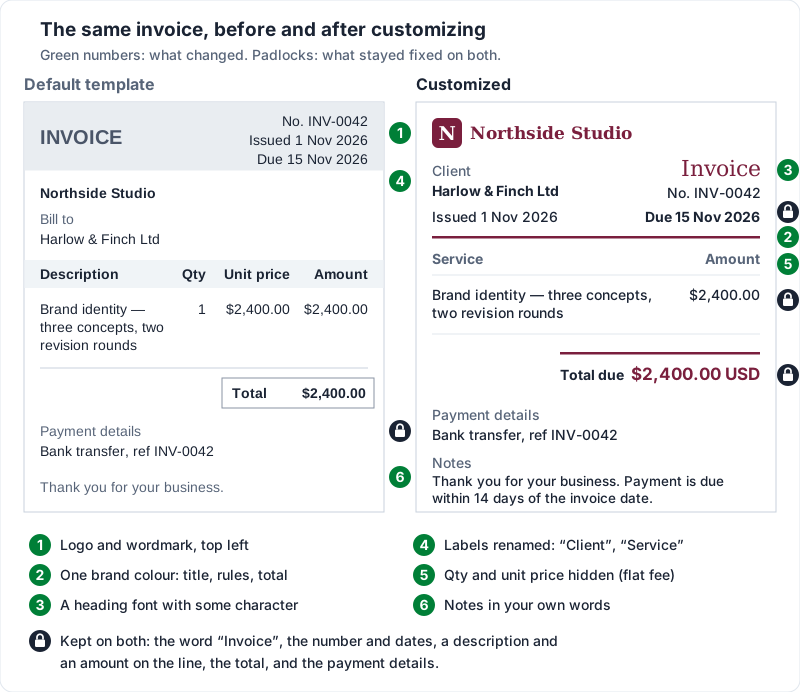
The rest of this post works through those rows. For the design principles underneath them, such as visual hierarchy, type and white space, invoice design: principles, layouts and examples goes deeper.
Logo, colours and fonts#
Logo. Use the version that still reads when small. Most small businesses have a wordmark, and a wide wordmark at the top left is the most conventional, least surprising position. Upload a high-resolution file rather than a screenshot of your website, because invoices get printed and zoomed. For sizes, file types and placement in detail, see logo on an invoice.
Colours. Pick one brand colour and give it three jobs at most: the title or header, the rules between sections, and the total. A second colour is fine as a quiet accent. Body text stays near-black on white, because that is what stays readable on a phone in sunlight and on a grayscale photocopy.
Fonts. Two is plenty: one for headings, one for body text. A heading font with some character is where personality belongs. The body font carries addresses, descriptions and numbers, so pick something plain. If it offers tabular (fixed-width) figures, use them, so amounts line up down the column.
One thread from the public online discussions we read while researching invoicing (the people quoted are not Charming customers) shows how font and colour choices go wrong together:
I just found out my boss, a 40 something graphic designer, has been using powder blue comic sans on all of our invoices. Does he have no idea what he's doing or am I crazy?
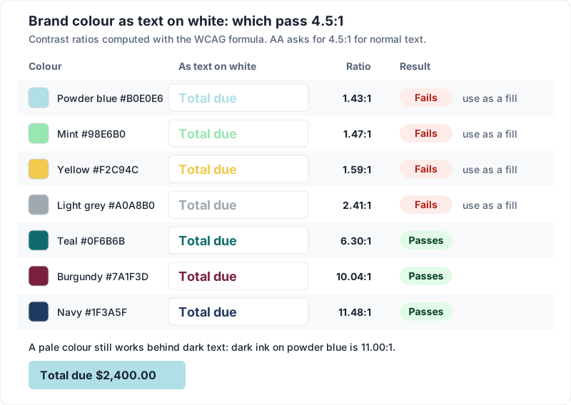
The typeface is half the problem. The other half is powder blue body text, which is too light on white to pass the contrast check further down this post.
Layout, labels and wording#
Layout. Conventions exist because your client's eyes already know them: your details at the top, the client's beside or below, number and dates near the top right, line items in the middle, totals at the bottom right. Designing invoices that move these around makes them look fresh and read slowly. Someone in the same research put the alignment rule well:
I'm not a fan of having everything centered. I like my words/addresses/descriptions left-justified and my numbers/dates/prices right-justifed for easy reading.
Text left, numbers right. A column of right-aligned amounts can be scanned and checked; a centred one cannot.
Labels. Renaming labels is one of the most useful customizations and the least used. The default words were written for everyone. A few renames that suit particular kinds of work:
| Default label | Photographer | Consultant | Contractor |
|---|---|---|---|
| Bill to | Prepared for | Client | Bill to |
| Description | Coverage | Service | Work |
| Quantity | Hours | Days | Qty |
| Unit price | Rate | Day rate | Rate |
| Notes | What is included | Engagement notes | Job notes |
Keep “Total due” or “Amount due” plain. Nobody needs a clever name for the number they are about to pay.
Notes and footer wording. This is where your voice can show without getting in the way. Lines you can copy and adapt:
Thank you for your business. Payment is due within 14 days of the invoice date.
Please use the invoice number as your payment reference.
Northside Studio is a trading name of Alex Morgan.
Usage licence for the images above begins once this invoice is paid in full.
The last line is the kind of term that belongs on the invoice only if it is already in your agreement. The footer is a reminder, not the place to introduce a new condition.
Columns and sections: show what the client needs#
Columns. A line needs a description and an amount. Everything else is optional. For a flat project fee, hide quantity and unit price: “Brand identity — three concepts, two revision rounds, $2,400.00” reads more cleanly than “1 × $2,400.00 = $2,400.00”. When you bill by the hour, day or item, show them, because a total the client can check gets queried less often than one that appears from nowhere.
Sections. Show a section only when it carries something. A signature block is rarely needed for freelance work. A tax summary belongs only on invoices that charge tax. A purchase order number matters whenever the client runs on POs (what a PO number on an invoice is for explains why it can decide whether you get paid this cycle). Payment details are the exception: they appear every time.
What should stay so it still reads as an invoice#
This is general information, not legal or tax advice. What an invoice has to contain differs by country, and sometimes by state or region, and the rules change. Check your own tax authority's guidance, and ask an accountant if you are unsure.
Three official pages show the pattern. The quotes are what each page said when we read it on 23 October 2026:
- United Kingdom. GOV.UK's guidance on what an invoice must include opens its list with “Your invoice must include:”, and the items include “a unique identification number”, “a clear description of what you’re charging for”, “the date of the invoice” and “the total amount owed”. Read the full list on that page.
- Australia. business.gov.au's invoicing guidance says “There’s no law that sets out what to put in a regular invoice.” In its common-practice list for regular invoices it gives “the word ‘invoice’ – you must not use ‘tax invoice’”, and for tax invoices it says “By law, you must include these details on all tax invoices:”, starting with “the words ‘tax invoice’”.
- European Union. The European Commission's invoicing page, under “What information must a VAT invoice contain?”, lists items including “Date of issue”, “Unique sequential number identifying the invoice” and “Description & quantity of goods or services supplied”.
So customization breaks an invoice when it touches the content layer. The usual ways:
- Renaming the title to “Bill”, “Statement” or “Receipt”. Those are different documents to an accounts team, and a receipt in particular says the money has already arrived.
- Hiding the invoice number or a date to tidy the header.
- Dropping a registration number your tax authority asks you to show, or adding “Tax invoice” when you do not charge VAT or GST. What a tax invoice is covers the extra fields that applies to.
- Hiding the tax line while still charging tax.
For the full field-by-field list, see what actually belongs on an invoice.
Language and currency#
In practice, most people invoice in the language they and their client work in. Tax invoices can have their own rules: in the UK, HMRC's VAT guide (Notice 700) says “You may write your invoices in a language other than English.”, with a condition about translations set out in the same paragraph, and section 16.3.1 lists “the total amount of VAT chargeable — this must be expressed in sterling” (as of 23 October 2026). Other countries set their own rules, so check your tax authority's guidance before you change the language or currency of a tax invoice. If you translate for a living, the translator invoice template covers billing by the word, the page and the hour.
For currency, name it with its code (USD, GBP, EUR), not only a symbol, since “$” alone is shared by many currencies. Invoice currency covers which currency to bill a client abroad in.
Accessibility and print: check before you send#
Contrast. The web accessibility standard, WCAG 2.2 success criterion 1.4.3, asks for a contrast ratio of at least 4.5:1 for normal text and 3:1 for large text (at least 18 point, or 14 point bold). It was written for web content, but it is a sound benchmark for a document most clients read on a screen. Pale brand colours (yellow, mint, light grey, powder blue) usually fail as text on white. Use them as a fill behind dark text, or for a rule, not for words.
Colour is not the only signal. WCAG success criterion 1.4.1 says colour should not be “the only visual means of conveying information”. On an invoice that means writing “Overdue” or “Credit”, rather than turning a number red and hoping it is noticed.
Size. We would not set body text below 9 point; 10 or 11 is comfortable. Terms in tiny grey text are still terms your client is expected to read.
Print. Print one copy in black and white. If the total disappears into a coloured band, or a letterhead pattern runs behind the line items, fix it. Putting your letterhead on an invoice shows where artwork can safely sit. Pick your client's paper size: Letter is the norm in the US and Canada, A4 in most other places.
PDF. Send a PDF so the fonts and layout arrive as you set them, and open it on your phone first. How to send invoices by email covers the message that goes with it.
Mistakes that make a custom invoice harder to pay#
- Too many colours. Three brand colours on one page look like a flyer, not a bill.
- Tiny or pale text. Light grey 8 point text looks refined on screen and vanishes on a printout.
- Burying the total. It should be the most prominent number on the page.
- Hiding the due date. It belongs near the top as a real date, not only in the footer.
- A decorative font on the numbers. Script faces can make a 1 look like a 7.
- An oversized logo that pushes the line items onto a second page.
- A new design every month. Consistency makes an invoice recognisable. Choose once, then leave it.
Customizing an invoice in Charming Invoices#
Charming Invoices is built around the split above: change the presentation freely, keep the content intact. Everything here is on the free plan.
- 60 templates in eight layout styles, from formal to receipt-style, all on the templates page.
- 30 fonts, set separately for headings and body, with title and body sizes, heading case and tabular numbers.
- Your brand colour as any hex code, plus the other page colours. The Template Studio flags the main text-and-background pairs (body text, muted text, the brand colour and header text) when they fall below the WCAG AA ratio and offers an “Auto-fix”, and header text on a coloured band switches to a readable colour if yours would not be.
- Your logo (PNG or JPEG, up to 2MB), with position and size, and an optional full-page letterhead (PNG or JPEG, up to 5MB) on every page or the first only.
- Renamed labels for the printed words, from “Bill to” to “Total due”, and renamed column headers.
- Columns and sections you can show or hide, and reorder below the totals. Description and amount always show.
- Brand import: give it your website or images (a logo, a business card, an old invoice) and it suggests three matching designs, which stay editable.
The template is the part that changes the most at once. These are two of the 60, Classic and Bold, filled with the same sample invoice:
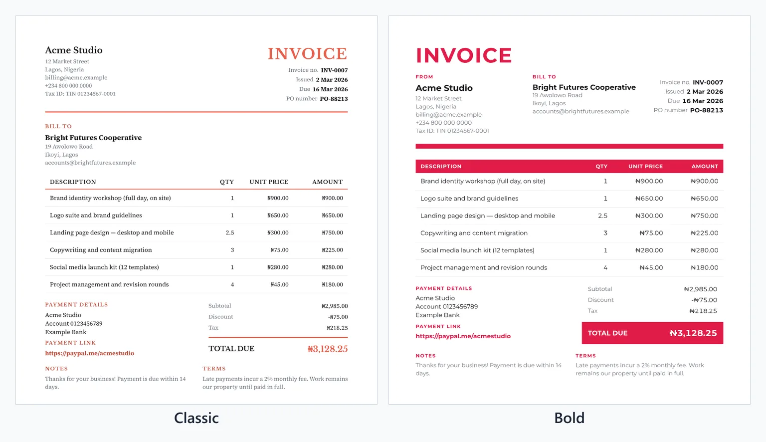
Issued invoices keep the design they were issued with, so changing your template later does not rewrite invoices already issued.
Where it will let you down#
| Area | The limit |
|---|---|
| Footer line | Free invoices print a small “Sent with Charming Invoices” line in the footer. Paid plans, from $29 once, hide it by default. |
| Scripts in the PDF | Arabic, Hebrew, Thai, Bengali, Khmer, Chinese, Japanese and Korean characters, and emoji, do not render in the PDF; they come out blank. The web view of the invoice is not affected, but the PDF is what gets filed. |
| Numbers and currency | In the PDF, amounts use comma thousands and a decimal point (1,234.56) whatever language your labels are in, a few currency symbols (such as the Thai baht) print as the ISO code, and “Amount in words” spells the total in English only. |
| Fonts | You cannot upload your own typeface, and each font comes in regular and bold only (three display faces have a single weight). Brand import matches your website's font to the nearest of the 30. |
| Layout | The template owns the skeleton. You cannot drag fields anywhere you like on the page. |
| Brand import | An optional image-reading step has hourly and daily limits; after that, it reads colours from the pixels alone. |
If those limits fit how you work, create a free invoice and set your logo, colour and labels once. If they do not, the checklist above still works in whatever tool you use.